

Introduction
Today more people use their phones to browse the internet than their computers. If your website looks broken, loads slowly, or is hard to use on a mobile screen, you are losing visitors, customers, and search rankings every single day. That's why running a Mobile Friendly Test is one of the smartest things you can do for your website in 2026.
In this guide, you'll learn what mobile-friendliness really means, why it matters more than ever this year, and exactly how to check your site using a simple Mobile Friendly Test checker. We'll also walk through common mobile issues, how to fix them, and how to keep your site in good shape going forward.
What Is a Mobile-Friendly Website?
A mobile-friendly website is a website that automatically adapts to different screen sizes, allowing visitors to browse comfortably on smartphones, tablets, and other mobile devices.
Instead of forcing users to zoom in or scroll sideways, a mobile-friendly website adjusts its layout, images, buttons, and text to fit the available screen space.
A mobile-friendly website usually includes:
- Responsive page layouts
- Easy-to-read text
- Fast loading pages
- Proper spacing between buttons
- Images that resize automatically
- Navigation designed for touch screens
- Content that fits within the device width
When these elements work together, users can browse your website without frustration.
How to Find Out If Your Website Is Mobile-Friendly
The good news is that you don't need any technical skills to test your website. You just need the right tool. That's where a Mobile Friendly Test checker comes in.
Step 1: Use a Mobile Friendly Test Tool
Instead of guessing whether your site works well on phones, use a dedicated testing tool that analyzes your site automatically. Smooli AI's Friendly Test tool is built exactly for this. Simply paste your website URL, click "Check Now," and get a full mobile-friendliness report within seconds, no sign-up or technical knowledge required.
Step 2: Review Your Overall Score
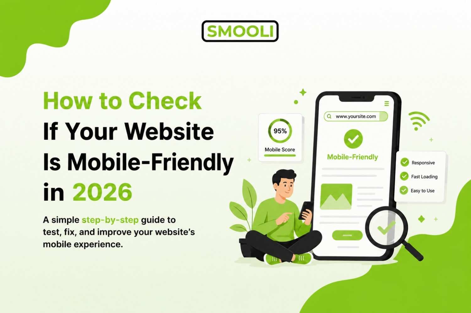
Once the scan finishes, you'll see an overall mobile-friendly score as a percentage. This score gives you a quick snapshot of how well your site performs on mobile devices. A high score (like 90% or above) generally means your site is in great shape, while a lower score points to specific areas that need attention.
Step 3: Check Each Individual Factor
A good mobile test doesn't just give you one number, it breaks down the details so you know exactly what to fix. Here are the main checks you should pay attention to:
Viewport Meta Tag: This is a small piece of code that tells browsers how to adjust your page's dimensions and scaling for different devices. Without it, your site may appear tiny or oddly zoomed-in on phones. This should always show as "Present and Correct."
Mobile CSS / Responsive Design: This checks whether your website uses modern responsive techniques like CSS Media Queries, Flexbox, and CSS Grid, to reshape your layout for different screen sizes. A responsive design means your content automatically rearranges itself instead of forcing users to scroll sideways.
Responsive Images: Images that don't resize properly can break your layout or slow down your page. This check looks at whether your images adapt to different screen widths and load in an optimized way.
Text Readability: If your font size is too small, visitors will have to pinch and zoom just to read a sentence. This check confirms whether your text is comfortably readable on a small screen without extra effort.
Touch Elements: Buttons, menus, and links need enough spacing and size for someone to tap accurately with a finger, not a mouse pointer. If buttons are too close together or too small, users will constantly tap the wrong thing, which frustrates visitors and increases bounce rates.
Step 4: Fix the Issues Found
Once you know exactly what's holding your site back, you can start making improvements. We'll cover common fixes in the next section.
Step 5: Re-Test Regularly
Mobile-friendliness isn't a one-time task. Every time you add new pages, install a new theme, or update plugins, something could break your mobile layout without you noticing. Make it a habit to re-run your Mobile Friendly Test checker every few weeks, or right after any major website update.
Common Mobile-Friendliness Problems (And How to Fix Them)
Even a well-designed website can have hidden mobile usability issues. Here are the most common mobile-friendliness problems and simple solutions to help improve your site's performance and user experience.
Problem: Missing or Incorrect Viewport Tag
Fix: Make sure your website's HTML includes a proper viewport meta tag in the <head> section. This single line tells the browser to match the page width to the device's screen width, which is the foundation of any mobile-friendly design.
Problem: Non-Responsive Layout
Fix: If your website was built years ago using a fixed-width layout, it likely won't adjust to smaller screens. Switching to a responsive theme or framework that uses flexible grids and media queries solves this. Modern website builders and most current templates already include this by default, but older or custom-coded sites often need updates.
Problem: Images That Don't Scale Properly
Fix: Use responsive image techniques so pictures resize based on the visitor's screen, instead of loading one giant image for every device. Compressing images also helps your mobile pages load faster, which matters even more on mobile data connections.
Problem: Small or Hard-to-Read Text
Fix: Set a comfortable base font size (usually at least 16px for body text) and make sure your website's stylesheet doesn't shrink important text on smaller screens. Avoid relying on users to zoom in just to read your content.
Problem: Buttons and Links Too Close Together
Fix: Give clickable elements enough padding and spacing so fingers don't accidentally tap the wrong link. As a general guideline, touch targets should be large enough and spaced apart enough to tap comfortably on a small screen.
Problem: Slow Loading Speed on Mobile
Fix: Reduce unnecessary scripts, compress images, and rely on caching to speed up load times. Mobile visitors are often on slower or less stable connections than desktop users, so every second counts.
Problem: Intrusive Pop-Ups
Fix: Avoid pop-ups that cover the entire screen and are difficult to close on mobile. If you need pop-ups for newsletters or promotions, make sure they're easy to dismiss and don't block your main content.
Why Mobile-Friendliness Matters More in 2026
A few years ago, having a mobile-friendly site was a nice bonus. Today, it's a requirement. Here's why this matters so much right now.
1. Mobile Traffic Keeps Growing
Every year, more people rely on their phones for browsing, shopping, and researching. Desktop use hasn't disappeared, but for a huge share of websites, mobile visitors now make up the majority of traffic. If your site isn't built for phones, you're ignoring the way most of your audience actually browses.
2. Google Uses Mobile-First Indexing
Search engines like Google now look at the mobile version of your website first when deciding how to rank it, not the desktop version. This means if your mobile site is missing content, slow, or poorly formatted, it can directly hurt your search visibility even if your desktop site looks perfect.
3. User Experience Affects Everything
A visitor who lands on a confusing, slow, or broken mobile page usually leaves within seconds. That's a lost lead, a lost sale, or a lost reader. Search engines notice this behavior too, since high bounce rates and short visit times are signals that your site isn't meeting user expectations.
4. Core Web Vitals and Page Experience
Search engines increasingly reward sites that load fast, respond quickly to taps and clicks, and don't shift content around unexpectedly while loading. These factors, often grouped together as "page experience" signals, are far more likely to be a problem on mobile devices with slower connections and smaller processors.
Mobile-Friendly Test vs. Other SEO Checks
A Mobile Friendly Test helps you see how well your website works on smartphones and tablets. However, mobile optimization is only one part of a strong SEO strategy. To improve your website's overall SEO, you should also check your content quality. For example, using a keyword density checker can help you make sure your keywords are used naturally without overusing them. This keeps your content easy to read for visitors and better optimized for search engines.
By combining a Mobile Friendly Test with other SEO checks, you can improve both your website's technical performance and content quality, creating a better experience for users and increasing your chances of ranking higher in search results.
Frequently Asked Questions
Find answers to the most common questions about mobile-friendly websites, Mobile Friendly Test tools, and how mobile optimization can improve your website's SEO and user experience.
1. How often should I run a Mobile Friendly Test?
It's a good idea to check your website at least once a month, and immediately after any major update, redesign, or plugin installation. Frequent testing helps you catch problems before they affect your traffic.
2. Can a website be mobile-friendly but still load slowly?
Yes. Mobile-friendliness and page speed are related but not identical. A site can technically resize correctly on mobile devices while still being slow due to large images, excessive scripts, or poor hosting. That's why it's important to check both responsiveness and speed together.
3. Will fixing mobile issues really improve my rankings?
While no single factor guarantees higher rankings, mobile-friendliness is a well-established part of how search engines evaluate and rank websites. Combined with strong content and good page speed, it can meaningfully improve your visibility and user experience.
4. Is Smooli AI Mobile Friendly Test free to use?
Yes. You can enter your website URL and get a full mobile-friendliness report without any cost or technical setup.
5. What are the most common mobile usability issues?
Some common issues include text that's too small to read, content wider than the screen, buttons that are too close together, slow-loading pages, and images that don't resize properly on mobile devices.
Final Thoughts
A mobile-friendly website is no longer optional, it's essential. It helps visitors use your site more easily, supports better SEO, and can lead to higher engagement and conversions. As more people browse the web on mobile devices, keeping your website mobile-friendly should be a top priority.
The easiest way to see how your website performs is to use a reliable Mobile Friendly Test. The Smooli AI Mobile Friendly Test quickly checks your site and provides a clear report on important factors like responsive design, viewport settings, text readability, responsive images, and touch-friendly buttons. With these insights, you can identify issues, make improvements, and create a better experience for every visitor.