

Introduction:
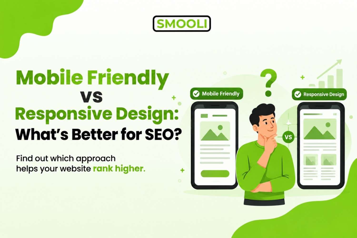
Responsive design is usually better for SEO because it automatically adjusts your website to fit different screen sizes while using the same URL and website structure. This makes it easier to manage and helps search engines understand your site. A mobile-friendly website simply means it works well on phones, but it may use a separate mobile version. In simple terms, every responsive website should be mobile friendly, but not every mobile-friendly website is responsive.
If you're confused about these two terms, you're not alone. Most website owners use "mobile-friendly" and "responsive design" as if they mean the exact same thing. They don't. And if you pick the wrong approach for your website, it can quietly hurt your SEO, your bounce rate, and your rankings on Google.
In this guide, we'll break down what each term really means, how they affect your search engine rankings, and which one you should actually choose for your website in 2026.
What Does Mobile Friendly Really Mean?
A mobile-friendly website is simply a website that is easy to use on a smartphone or tablet. The text should be easy to read, buttons should be easy to tap, and users should not need to scroll from side to side.
A website can be made mobile friendly in different ways:
- Separate mobile website: A different version of the site, such as m.yoursite.com, designed for mobile users.
- Dynamic serving: The same URL shows different content or code depending on the device.
- Basic mobile optimization: Simple changes like larger text, better spacing, and easier menus.
These methods can work, but they may require extra technical work and maintenance. Separate mobile versions can also create issues with redirects, duplicate content, and keeping desktop and mobile content consistent.
This is why responsive web design is a popular choice for modern websites. It allows the same website to automatically adjust to different screen sizes. Want to see if your website works well on mobile? Use a mobile-friendly test to quickly check your page and find potential mobile usability issues.
What Is Responsive Web Design?
Responsive web design is an approach where a website automatically adjusts its layout according to the user's screen size and device. Instead of creating completely separate versions of a website for desktop and mobile, responsive design uses flexible layouts, images, grids, and CSS rules to make the same website work across different screen sizes.
For example, a desktop page might display three product columns side by side. On a smartphone, those same products can automatically change into a single-column layout.
Responsive websites can adapt to:
- Smartphones
- Tablets
- Laptops
- Desktop computers
- Large monitors
- Different screen resolutions
The main idea is simple: one website adapts to different devices. This makes responsive design particularly useful for businesses, bloggers, ecommerce stores, publishers, and websites that need to provide a consistent experience across many devices.
Mobile Friendly vs Responsive Design: The Core Differences
Let's put both side-by-side so the difference is crystal clear.
| Factor | Mobile Friendly | Responsive Design |
|---|---|---|
| URL structure | Can use separate URLs (m.site.com) | One single URL for all devices |
| Codebase | May have multiple versions | One single codebase |
| SEO impact | Can dilute link equity and cause duplicate content | Consolidates ranking signals in one place |
| Maintenance | Higher update multiple versions | Lower update once, reflects everywhere |
| User experience | Decent, but inconsistent across devices | Seamless and consistent |
| Google's recommendation | Acceptable, but not preferred | Officially recommended approach |
| Redirect issues | Common (redirecting desktop users to mobile URLs) | None |
| Crawl efficiency | Splits crawl budget across versions | Uses crawl budget on one page |
The biggest takeaway here: mobile-friendly is a result, while responsive design is a method. You can achieve a mobile-friendly result through several methods, but responsive design is widely considered the best method to get there without creating extra SEO headaches.
Why This Distinction Matters for SEO
Here's where things get important. Google has been using mobile-first indexing for years now, which means Google predominantly uses the mobile version of your website's content for indexing and ranking even if someone searches from a desktop computer.
If your mobile version and desktop version show different content (which often happens with separate mobile sites), Google might index the leaner mobile version meaning any content that only exists on your desktop site could be ignored entirely for ranking purposes.
Here's how each factor plays out under mobile-first indexing:
1. Duplicate Content Risk
Separate mobile URLs can accidentally create duplicate or near-duplicate content issues if canonical tags and rel="alternate" tags aren't set up perfectly. Responsive design eliminates this risk completely since there's only one URL and one set of content.
2. Page Speed and Core Web Vitals
Google's Core Web Vitals metrics like Largest Contentful Paint (LCP) and Cumulative Layout Shift (CLS) are measured heavily on mobile performance now. A responsive site, when coded efficiently, tends to load faster because there's no redirect chain sending users from one URL to another.
3. Backlink Equity
If people link to your desktop URL, but Google is indexing your mobile URL, your valuable backlinks might not fully support the page that's actually being ranked. Responsive design keeps all backlinks pointed at one single URL, so your link equity stays consolidated instead of getting split.
4. User Experience Signals
Google also watches behavioral signals bounce rate, dwell time, and interaction patterns. A janky, inconsistent mobile experience (common with poorly-built separate mobile sites) increases bounce rates, which can indirectly hurt rankings over time.
If you want to understand exactly how deep this connection goes between your site's mobile experience and your search visibility, this breakdown on why mobile friendliness matters for SEO in 2026 covers the ranking factors in much more detail.
Does Responsive Design Help SEO?
Yes, responsive design can make SEO management easier. One major advantage of responsive design is that you can maintain one website and one set of URLs for your content across different devices.
For example, imagine your Tools available at:
Smooli.ai/seo-optimization-tools
With responsive design, the same URL can serve the content to visitors on desktop computers, tablets, and smartphones. The layout simply changes based on the available screen size. This can make website management simpler because you do not have to maintain completely separate desktop and mobile pages.
Responsive design can also help with:
1. Consistent Content
Your mobile and desktop visitors can access the same core content. This is important because search engines need to understand the content available on your pages.
2. Easier SEO Management
With one responsive website, you generally have fewer versions of pages to manage. You can focus your SEO efforts on one URL structure, one set of content, and one website architecture.
3. Better User Experience
A properly responsive layout can make content easier to read and navigate on different screen sizes.
4. Easier Maintenance
When you update a page, you usually update the same page rather than maintaining separate desktop and mobile versions.
5. Better Cross-Device Experience
Visitors can move between devices without encountering completely different versions of the website.
Common Myths About Mobile Friendly and Responsive Design
Let's clear up a few misunderstandings that trip people up constantly.
Myth 1: "My site looks fine on my phone, so it's mobile-friendly."
Looking fine on your phone doesn't mean it performs well across hundreds of screen sizes, browsers, and connection speeds. Proper testing tools evaluate tap target sizes, viewport configuration, font legibility, and more things you can't judge with just your eyes.
Myth 2: "Responsive design and mobile-friendly design cost the same to build."
Not always true. Responsive design usually requires more thoughtful planning during the design phase (breakpoints, flexible grids, scalable assets), but it saves money long-term because you're maintaining one website instead of two.
Myth 3: "If Google indexes my page, it must be mobile-friendly."
Indexing and ranking well are two different things. Google can index a non-mobile-friendly page but rank it lower in mobile search results compared to competitors with a smoother mobile experience.
Myth 4: "Responsive design guarantees good SEO."
Responsive design removes technical obstacles, but it doesn't automatically fix bad content, slow servers, or weak keyword targeting. It's a foundation, not a magic fix.
Frequently Asked Questions
1- Is mobile friendly the same as responsive design?
No. Mobile friendly describes how well a website works on mobile devices, while responsive design is a method that allows a website to adapt to different screen sizes.
2- Is responsive design better for SEO?
Responsive design is generally a practical choice for SEO because it can provide one URL and consistent content across devices, making the website easier to manage and optimize.
3- Does Google prefer responsive websites?
Google does not simply rank websites higher because they use responsive design. What matters is that the website can be properly accessed, crawled, indexed, and used by visitors.
4- How do I know if my website is mobile friendly?
You can test important pages with Smooli mobile-friendly testing and also manually check your website on different smartphones and screen sizes.
5- Does responsive design improve page speed?
Responsive design itself does not automatically make a website faster. Performance depends on factors such as image sizes, JavaScript, CSS, hosting, caching, and other technical elements.
6- Is responsive design necessary for small local business websites too?
Yes. Local searches happen overwhelmingly on mobile devices, think "plumber near me" or "best coffee shop nearby." If your local business site isn't responsive, you're likely losing potential customers to competitors with a smoother mobile experience.
Conclusion
The debate between Mobile Friendly vs Responsive Design becomes easier when you understand that they are not competing concepts. Mobile friendliness is the outcome you want: a website that people can comfortably use on smartphones and other mobile devices. Responsive design is one of the most effective ways to achieve that outcome.
For a modern website, the ideal approach is to use responsive web design, optimize your pages for mobile performance, provide accessible content, and regularly test your website on different devices.
Don't assume your website is mobile friendly just because it looks good on a desktop. Test it, identify problems, fix them, and test again. A better mobile experience can help your visitors find, read, navigate, and interact with your content more easily, which is exactly what a modern SEO strategy should aim to achieve.